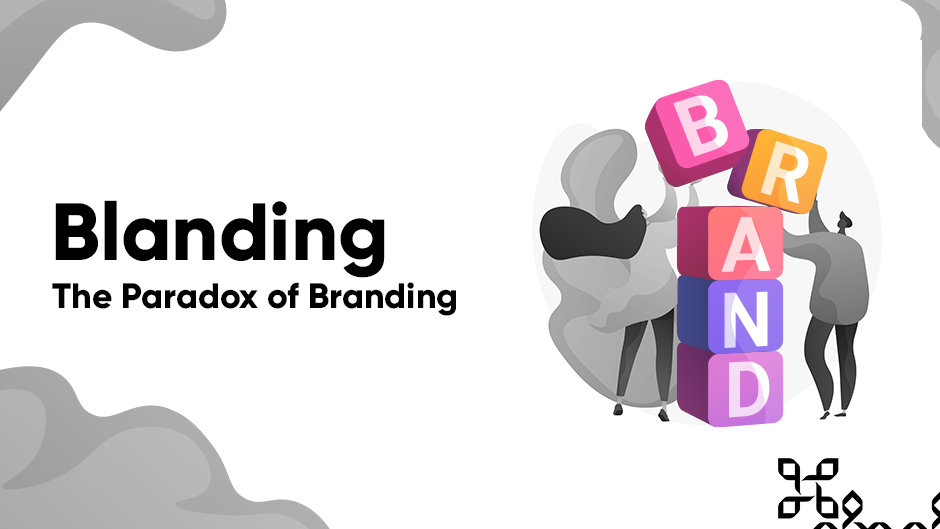
Blanding - The Branding Paradox
Author: Admin
Date: 20th September, 2021
“The new logo has a heavier, bold look with a geometric sans-serif treatment.” This is how Bloomberg has described the new Burberry Logo. However, this could actually be describing any number of recent logos – from Balenciaga and Berluti to Saint Laurent and Rimowa. Due to the latest trend in branding, or better yet, “blanding”.
The “Blanding” is basically how all major executives across a variety of industries in the fashion, consumer goods, tech and many more, are rebranding towards a generic black sans-serif font on a white background.

The Cause
The primary cause for this trend to arise has been because of the major fashion and tech players in the world. Brands like Google, Yves Saint Laurent, Uber. These companies have bold, simple visual identities that match their bold, well-defined products. Their branding has evolved to reflect their powerful missions. For example, Google’s logo wasn’t always the “G” that we see today, the company has evolved hence its logo to become a better representation of the company over time.
Many up-and-coming brands attempt to capture the aesthetic of these well-established companies thinking that simplicity in their designs will reflect a sense of sophistication. However, they are lacking the essence of what makes these simplistic brands effective. The brand has to capture the meaning of the idea and make it memorable. Once that connection has been made between value and brand, in the eyes of the viewer then only is it possible to use certain cues to callback the brand at a later stage. These major players have all had their brands evolve from pure complexity to the simple designs they are now.

The Effect
In design, simplicity has always meant sophistication. But simplicity has also carried an implication of cleverness, ingenuity, creativity, or all of those things. Companies are following in the footsteps of giants, without any of the things that created them giants in the first place.
It all comes down to personality. Which takes time to develop and evolve. Without which, there’s nothing for people to hang onto. Except possibly a sans-serif typeface. That’s when branding rings hollow and ends up backfiring—the so-called brandscape becomes a blandscape*, and everyone crowded within this just becomes generic.

The Solution
All brands are created with one single purpose. To be different. If all logos in an industry begin to blend they lose their differentiation. This does not mean that we revive the design style of the 1970s, but to create brands that reflect the business and its purpose in a way that is unique.
Are you interested in similar content? Follow us on our social media!