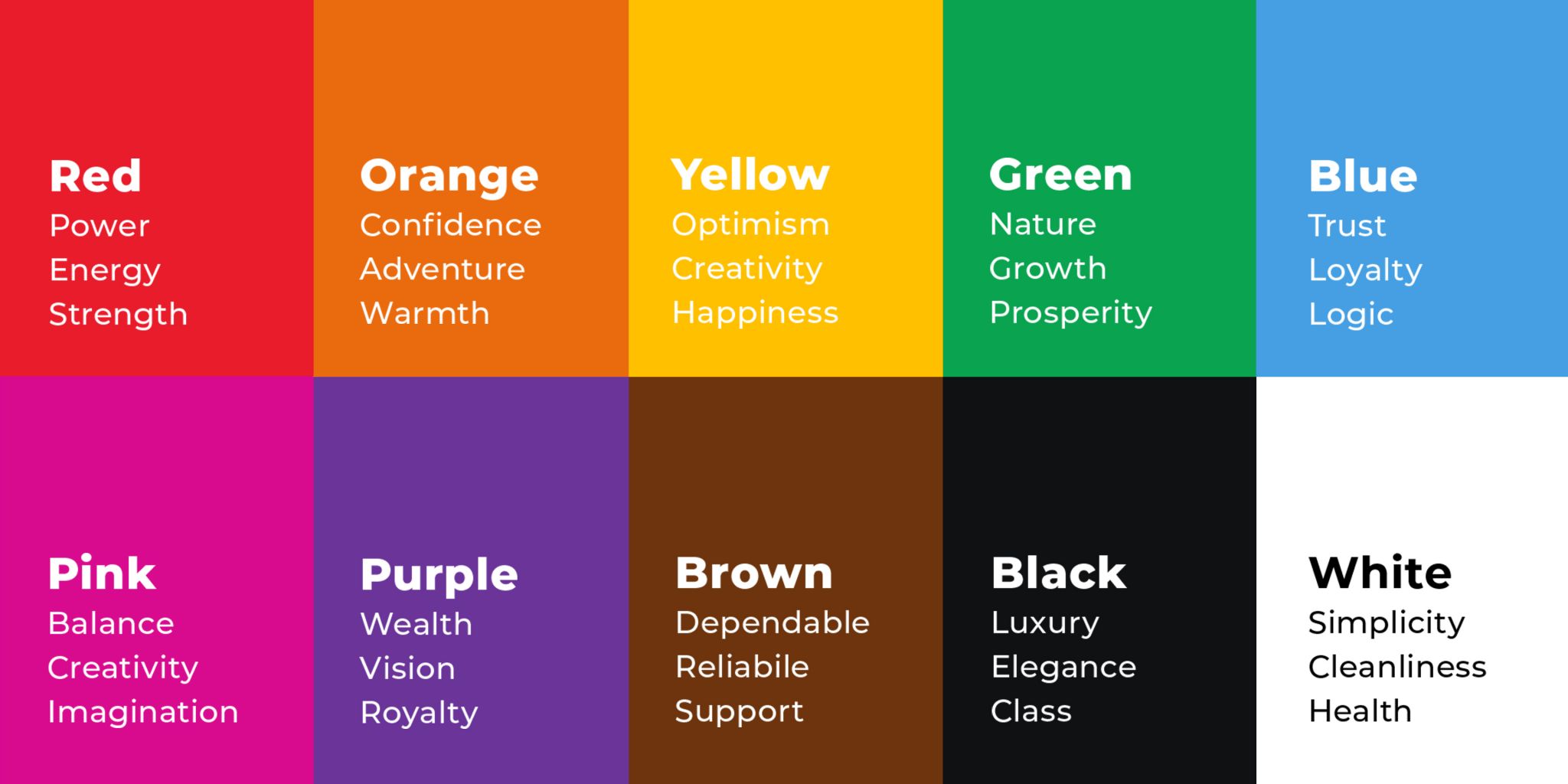
Color psychology studies the impact of different colors and tones on the human mind, and how they use of particular colors evoke a certain response.
We have all heard the phrase “First impressions never lie” and color plays a significant role in that first impression, and this key fact is widely used by successful content creators.
Knowing which colors, tints, hues, and shades to use to evoke certain emotions which subsequently leads to actions, is a subtle yet powerful tool to implement.
This infographic below provides deeper insight into how different colors elicit certain reactions.

How to Use Colors in Your Content
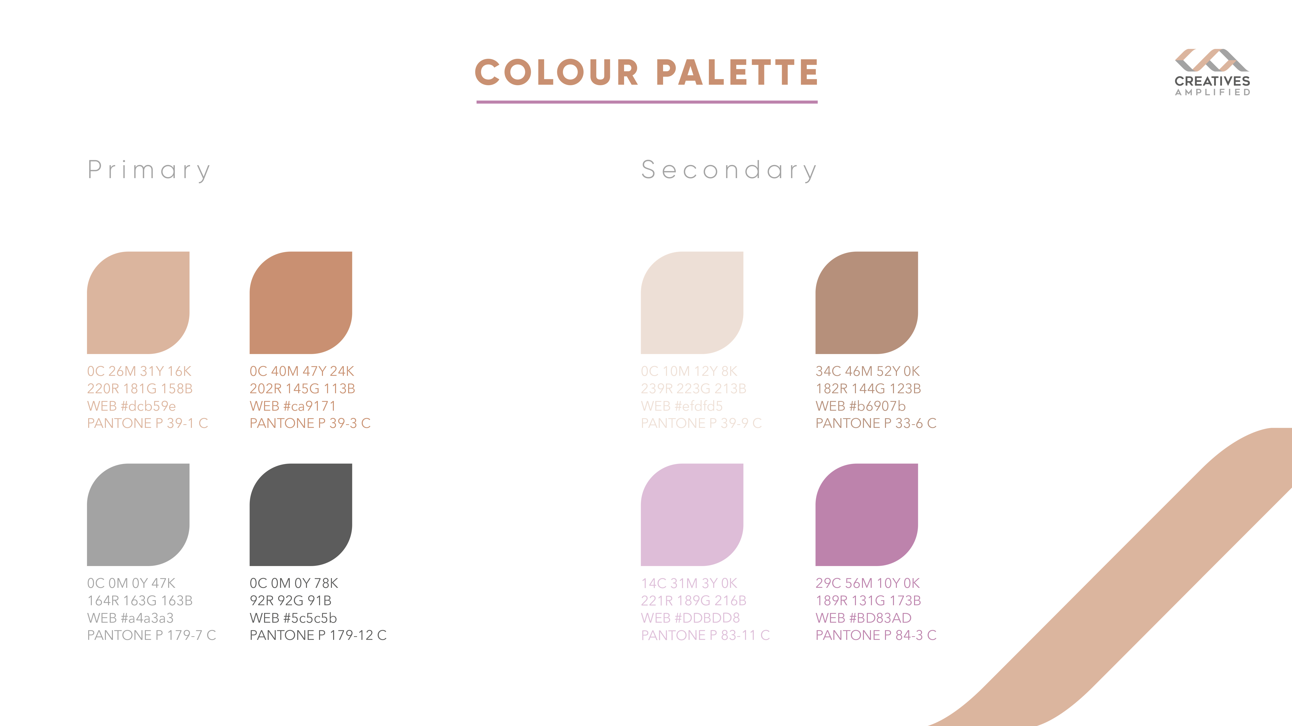
Choose a color pallet that represents your brand
Here at Creatives Amplified always consider your brand’s overall perception when advising on your content creation.
Let’s see if you can understand the psychology behind our colors.
A) Powerful, Strong, Attention-Grabbing
B) Creative, Reliable, Sophisticated
C) Confident, Growth, Visionary 
If you answered B then you are correct! You already one step closer to understanding color psychology.
Pick two primary colors and a contrasting color
When picking a color in content creation and overall branding, we recommend choosing two main colors and a color that contrasts them well. Two primary colors stick better in the viewer’s mind. Think of all major brands, there are always two colors you can relate to.
Once you have your colors decided let’s look at how you implement those into your branding and content.
Website
We recommend the overall website be in tone with the colors of your brand. This is why it is vital to have a contrasting color in your branding. Negative space is important as recent trends have evolved towards simplistic design.
Social Media
Utilizing the colors from your brand gets a bit harder here. As you will be sharing multiple items that may not specifically match with a color theme and palette. We recommend two strategies commonly used by color conservatives where all colorful items are simply made grayscale. This ensures that your content keeps its consistency. The other strategy is to always brand any items that you plan on posting to your social media. This guarantees some consistency in your content while also representing the real vision of the piece.
Call-to-action Buttons
These are your conversion generators. All call-to-action buttons should utilize the strongest color in your pallet to stand out from the rest of your content. We recommend testing out which colors from your branding generate the highest number of conversions.
Are you interested in similar content? Follow us on our social media!
